Monday, December 10, 2007
Monday, March 12, 2007
Sunday, March 11, 2007
Saturday, March 10, 2007
Friday, March 9, 2007
Thursday, March 8, 2007
click here to download the interactive .pdf file
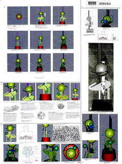
As you can see, the .pdf has embedded within it a means for rotating, panning, and zooming throughout the building. The interaction that takes place gives the user a certain power over the building. This technology has only recently been developed in such an accessible form. The ability to manipulate an imaginary space with limited knowledge of modeling programs and only a mouse is promising. Perhaps in the future, this technology will provide a basis for architectural critique and design. In the future, maybe it will be technology like this that will allow clients to more actively participate in the design process. This type of technology is also important in terms of how we experience a space. Interactive fantasy worlds like this one have gradually started to affect our concept of spatial awareness, and with the development of ever more realistic modeling techniques, soon maybe the two realms will start to merge. Architect Yu-Tung Liu comments on the subject: “If our cyberspace and networked space experience can ultimately influence our spatial concepts in the physical world, following the massy Egyptian space, geometric Greek space, mystic Gothic space, dynamic Baroque space, modernism space, there will be a brand new spatial theory, so called digitalism.”
Wednesday, March 7, 2007
This experiment is unique in the sense that the space that I am depicting has already been built. Normally, the material that I produced would only be used for buildings in design development. However, there is a need to compare the drawings and renderings to what they are actually portraying as a means for measuring their effectiveness. The first form of media that I chose was hand drawing. I chose to use a perspective view because that is the view that tells the most about any given area.
I also drew a section and plan of the room with AutoCAD to show the room’s general proportion and layout. Often these are the only types of drawings produced in smaller architectural projects.
I built a physical model of the space as well. This provided a great means for interpretation of space, but unfortunately it has to be shown in photograph format.
I also constructed a digital model that I used to create 3dimensional renderings. I chose to use materials that were more visually stimulating to make things more interesting.
I also filmed the room with a digital camera and created a 3d animation in a similar format. Video provides the best possible portrayal of the space because we get an accurate sense of scale and materials. I combined all of my material in the following narrated video:
After watching the video, it becomes clear that the best ways to sell someone an architectural idea is to rely on the digital realm. Physical models provide people with a great sense of space, but materials in such models often seem crude.
Tuesday, March 6, 2007
Monday, March 5, 2007
Sunday, March 4, 2007
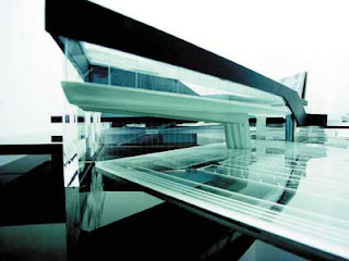
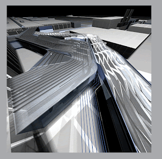
Zaha Hadid produced a building for BMW that was completely dependent on the digital realm and it yielded groundbreaking results in its streamlined appearance.
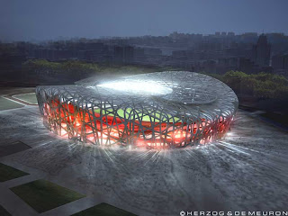
Herzog and DeMueron’s plans for the Beiking Olympic Stadium in China will also break the rules of traditional architecture. The aesthetics of the project were strictly developed on a computer.
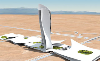
JDS architects and Snohetta Architects produce some of the most visually stimulating and exciting renderings and animations in the field at the moment.
Show me water color or perspective drawings that can do that.
Saturday, March 3, 2007
DMC5 exploits the potential of the fluidity of the digital realm in terms of designing, marketing, and communicating: “As a design tool, it [digital designing] affords a realistic view of design changes before any final and expensive decisions are made. Difficult to visualize designs and details can be accurately viewed early in the process. This often leads to a better design at a lower cost. Images like the ones shown in our gallery are a fantastic marketing tool. They are capable of generating sales before any construction investment begins. By clearly being able to see what something looks like before it actually exists, the images have now become a powerful communication tool which can show the impact of construction to zoning officials, neighboring residents, financial backers and others. Accurate imagery helps remove the doubt and allows those involved to agree on a design and help to expedite the process.”
Friday, March 2, 2007
Before the invention of such accurate methods of structural analysis prior to the invention of accurate programs, such innovation would not have been possible. In fact, in 1889 to 1908, Architect Antoni Gaudi wished to create a highly complicated structure that would break the trend of the current architecture. He developed a system to build the Colonia Guell Church, a very influential building in Spain. The University of Strathclyde in Glasgow conducted a study on the process: “The hanging model is based on the theory of the "reversion of the catenary." A chain suspended from two points will hang spontaneously in the shape of a so-called "catenary". Only tension forces can exist in the chain. The form of the catenary upside down gives a perfect shape for an arch of stone masonry, and in such an arch only reversed forces of tension, being compression, will occur.
In Gaudi's hanging model a system of threads represents columns, arches, walls and vaults. Sachets with lead shot resemble the weight of small building parts… Gaudi spent ten years working on studies for the design, and developing a new method of structural calculation based on stereostatics.” Lucky for Gaudi, he had the time, intelligence and resources to conduct such a study to make possible the creation of something incredibly different. Today, all it would take is a computer and an imagination.
Thursday, March 1, 2007
Wednesday, February 28, 2007
"Bilbao was sort of the big landmark that showed the world things were possible (with BIM) that couldn't be done in any other process," said Dennis Shelden, chief technology officer of Gehry Technologies, a software and services firm commercializing some of the techniques and tools developed for Gehry projects. "The types of buildings Frank does could not be done through conventional descriptive means and conventional ways of documenting," Shelden said. "The big question that's out there is where's the tipping point for this technology to be applied to more conventional work?"
The future of ‘digital construction’ is entirely unknown. Gehry produced the building nearly thirteen years ago. Vast advances have been made since then. The development of BIM programs marks another vast improvement in the functionality of the production of architecture. Computer Assisted drafting took the place of hand drafting in the mid 1990’s. Prior to its establishment, hand drafting was the only method of drafting in existence. The old process was tiring, and unforgiving. CAD brought architecture into a world where production could occur in a matter of hours, rather than days. The problem with CAD however, is that it merely replicates the act of drafting. It does not alleviate problems in mis-communication, and difficulties in missing or erroneous information in line drawings. Building Information Modeling (BIM) is the future of digital drafting. Programs that utilize this system model 3D building entities in a single model that produces all 2D documentation. This system allows for multi-disciplinary connections in a simple and understandable model.
For example heating and cooling ducts are drawn in no less than three separate 2D line drawings in any given project. If a change is needed, the three drawings have to be changed. If there was an unforeseen effect on the duct’s changes on the ceiling plan, and no one saw it in time, the construction process would be delayed and the budget would rise significantly. In BIM design, inconsistencies are omitted because the change in the duct system automatically updates according to all factors in the project. BIM design allows you to think more about designing rather than about drafting.
Tuesday, February 27, 2007
Uncertainty as to what a project could look like once it is built can make for uneasy clients and unforeseen budget issues. In addition to the effects on the human psyche, the digital realm has radically altered construction techniques of high performance buildings. The Guggenheim museum in Bilbao, Spain serves as a landmark for the possibilities of contemporary architecture. The building was designed by Frank Gehry. Throughout his extensive career, Gehry made a habit of using traditional methods of designing, as any architect does: sketching, drawing, modeling, diagramming, etc. Gehry produced similar projects to that of the museum at Bilbao, but often received complaints from contractors about the constructability of such complex shapes. Bilbao was to be his most ambitious commission of this type to date, and it was not easily attainable given the resources of his time. So, he resorted to the use of the digital realm.
Jason Miller comments on this transition in the architect’s biography, Frank Gehry: “Contractors were wary of the cost overruns that could occur of complicated building specs were miscalculated, not to mention nervous about estimating the amount of time the designs would take to execute. A computer program rescued Gehry’s less executable building designs from oblivion. Called CATIA (Computer assisted three-dimensional Interactive Application)… Once Gehry is pleased with the [physical] scale model, the model is scanned into the computer and interpreted as a three-dimensional computer image, mapping each surface in detail. From the computer model, a final physical model and accurate architectural drawings can be created. The program also itemizes elaborate building specifications, allowing suppliers to produce titanium panels or stone blocks – or any other material of choice – to the exacting requirements of the design.”
Tuesday, February 20, 2007
Their presentation is simple like the rest of the submissions, and the project description is brief. It is the renderings of the project that support it. They are very well done digital renderings of what the building will actually look like when completed. Sketches and artistic renderings work well in the portrayal of ideas, but nothing is more realistic than a 3d rendering. The programs are designed to emulate the effects of light and reflections in photography. Sometimes the results can be so incredible that it becomes difficult to tell the difference between a rendering and a photograph.
They also included a stunning animation in their proposal:
In architecture we have never had the privilege of viewing buildings exactly as they will appear before they are constructed. The digital realm has given us this exiting opportunity. Alex Munt of SCAN Magazine comments on the potential of digital architecture:
"Over the last decade, architects - like many creative professionals - have taken advantage of… 3D modeling and animation software developed for the gaming and entertainment industries. However, where most gaming environments seem to be satisfied with simulacra of ‘real’ world building stock, Digital Architects have taken up the challenge of defining a new spatial aesthetics pertinent to the Information Age... and it is here that the real and the virtual share an exciting zone of intensity.”In the digital world, if something doesn’t look right it can be changed. The digital realm has removed uncertainty from the design process.
Monday, February 19, 2007
I will not comment on the design validity of the project above, however it contains two important attributes that the previous two entries did not. The first of which is the credibility of the designer. In the first submission, there was a sense that the creator did not care enough about his work to render the drawings appropriately or provide ample material. This presentation relies entirely on a single digital three dimensional model, and incredibly it seems to hold its weight better. This is because the vast majority of people in the world would have no idea where to begin when creating a three dimensional model. Contrary to the colored pencil, the digital model media choice comes with automatic credibility because the designer can do something that most others can not. The other said benefit to the digital realm is its fluidity. Although most cannot understand how a 3d model is built, they can understand its ability to change. In fact, Adam Montandon, Mike Phillips, Chris Speed of read/write/fold Architecture have created a program that attempts to exploit the digital realm’s fluidity by allowing users to literally manipulate their desired spaces and then print out actual models.
They were featured in the June 2004 issue of Performance Research: “read/write/fold Architecture exists somewhere between the data/code that defines them, the printed page that displays them and the 3d model (virtual and real) that manifests them.”
Sunday, February 18, 2007
This is another entry that uses the same form of media, but is decidedly more successful. The problem with the previous entry was its poor usage of the colored pencil. The strength behind this entry is the masterfully rendered colored pencil drawings. The same basic approach is used in presentation layout, but we get a much clearer picture of the designer’s ideas and her building. Although the colored pencil may work better when used well, I argue that the problem with such crude forms of drawing is more deeply seeded. The pencil is an ancient tool and it is used simply. Press it to paper, and residue from the graphite will create a mark. We know this from our days in elementary school. So, when we view the very well rendered image in the lower left corner of this presentation, we cannot help but think that someone sat down for days drawing all of those lines. We know how the drawing was completed. It was done with great detail and it would be near impossible to erase a part of the drawing and replace portions of it. For example, fictional architects ‘Francon and Heyer’, a creation of author Ayn Rand in her novel The Fountainhead, used to drape their drawings in a transparent cloth before they proposed them to their clients. This way, Rand believes, the client would be less inclined to suggest that something will be different because it already looks so finalized. Although this poses less of a problem on the architect, the building ultimately belongs to the client, and their suggestions should be easily implemented.
Saturday, February 17, 2007
The purpose of the next 4 posts is to analyze the effects of traditional and contemporary design media. The first board that will be analyzed approached the project traditionally. The presentation starts with a plan of the project, then it moves to a section; it finishes with an axonometric view. (A section drawing is a cut through the building and shows it height and space relationships. An axonometric drawing is a rotated full building view with isometric angles.) All of the drawings are done with what appears to be colored pencil and black pen. When I look at the presentation, my eye is drawn directly to the fireworks, then to the orange shading of the plan in the upper left. A good presentation leads the viewer directly to the big idea behind the building. The images of the site on the page distract from the importance of the drawings of the proposed building. An easy solution would be to omit the images and let the drawings be the central focus. However, it is my opinion that this would make the presentation slightly too drab. The true problem lies in the choice of media. Colored pencils are standard issue for school children; this is a stigma that I have maintained throughout my education. The media makes the project seem as though it was done by an amateur. This could be attributed to the fact that the drawings are poorly rendered, but the choice of media no doubt contributes to this. The hand drafting is stark and only suggests a rough massing. Viewers are not excited about the potential of this project because the credibility of the designer is tainted.
Friday, February 16, 2007
It is important to recognize the differences between these two processes before delving into the overlap between the digital realm and architecture. Normal building commissions account for the vast majority of all building commissions. Competitions are rare and regularly pertain to large public projects. The presentation material for a normal building commission is dense and is intended for use as a contract whereas competitions focus more on aesthetics. It is in the competition domain where we see the majority of the digital work. When the world trade center was going to be rebuilt, a competition was staged to allow designers from all over the world to contribute. It was one of the largest design competitions to date and there were 5,201 entries. There were loads of different media types that all intended to excite the viewer about the potential of his or her project. Each designer was allowed only one standard sized presentation board. The next 4 posts will analyze various boards media choices from the competition website. Design content and presentation layout will be mostly overlooked to focus more on the media.
Thursday, February 15, 2007
The process that each building must go through to be built is a simple one. Either the project is commissioned to a single architect, or there is a competition between designers to see who is issued the commission. Competitions are rare. Most of the buildings that are built today are commissioned to a single designer. This means that limited presentation materials are required. If the client has already chosen you as the designer of his building, you need not impress him further with a fancy presentation. During the initial design phase, simple sketches are sometimes drawn, but usually the project quickly moves on to the construction document phase. The documents that are produced during this phase are just that, documents. Drab and confusing, to the untrained eye, they only slightly allude as to what the project may turn out to look like.
Drawing supplied by Fuller Architects.
Prior to the establishment of this process, it was rare that the architect was even involved with issues such as detail or small aesthetic issues. Simple scaled plans or elevations were given to a builder who was told to construct the building to the best of standards.
“Typical of many working drawings of the time (1735), this only shows basic dimensions, with locations of stairs windows, and doors. The details were filled in by the builder" (Roth 98).
Guide books were later used by designers or builders themselves. These books included plates with elegantly drawn elevations and plans that were supplied as guides for potential projects.
Construction methods were not given; an experienced builder was still needed. Nevertheless, it is important to understand that aesthetic drawing style prior to a project’s construction was not introduced until well into the 19th Century.
Wednesday, February 14, 2007
(Image from 'Content', Blob vs. Box, p.70-71, AMO/OMA)
Blob
Energy Bar: Draws on advances in theory, mathematics and computing
Power Moves: Fluidity, Asymmetry, Biomorphism, Structural Dynamics, Multiplicity
Box
Energy Bar: Draws on intuitive appeal of orthogonality
Power Moves: Rationality, Golden Mean, Universality, Exactitude
Blob WINS
The blob wins because he’s fat
…and whatever else he wants to be. He gets to be whatever he wants because he lives in the digital realm. Look at that pathetic karate guy. You know exactly what he is going to do. He can only jump so high and those things that he shoots can only go so fast. He doesn’t have a chance.
Not enough architects have the courage to stray from the surety of hard lines and cardboard models. “Why does architecture dwell exclusively on the probable when it can dwell on the improbable?” (Architecture and Hygiene - Adam Kalkin p. 136) Improbability in architecture first exists in things digital. Its translation into built architecture often removes its intrigue. Can an architect truthfully promise the exciting things he shows you on his laptop?
The purpose of this blog is to explore the boundaries of architecture by way of digital design. Is a space better appreciated when a user can explore it before it is built? Many architects have turned to digital renderings and animations as a way of exciting the client. Is The Turning Torso as exciting as it appears in the digital realm?
How is this discrepancy justified? Is there a way to regulate it; or does it matter?
I will attempt to answer these questions over the course of the next 20 posts; I will resort to modern and historical precedents, user interaction response, and experimentation in different forms of media.